


PT
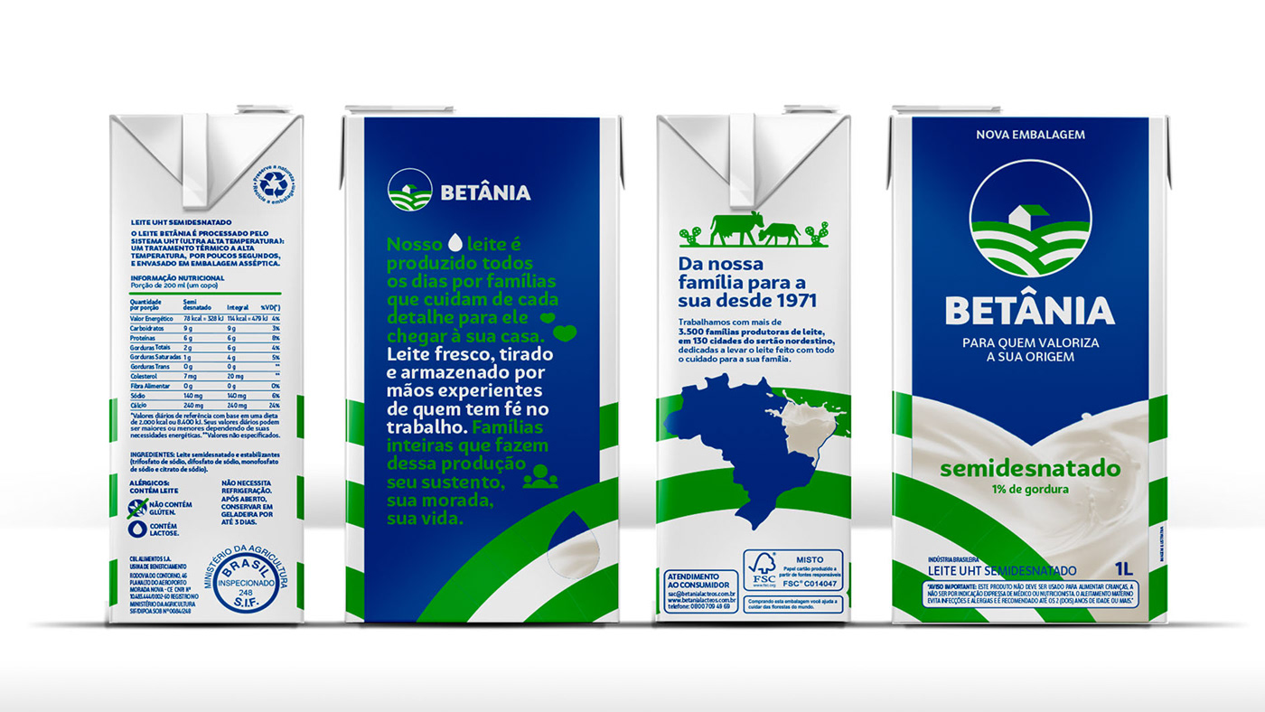
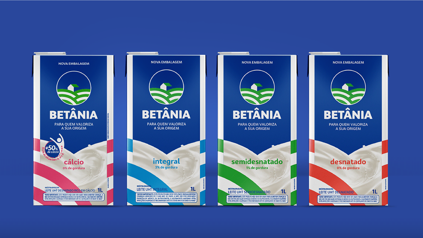
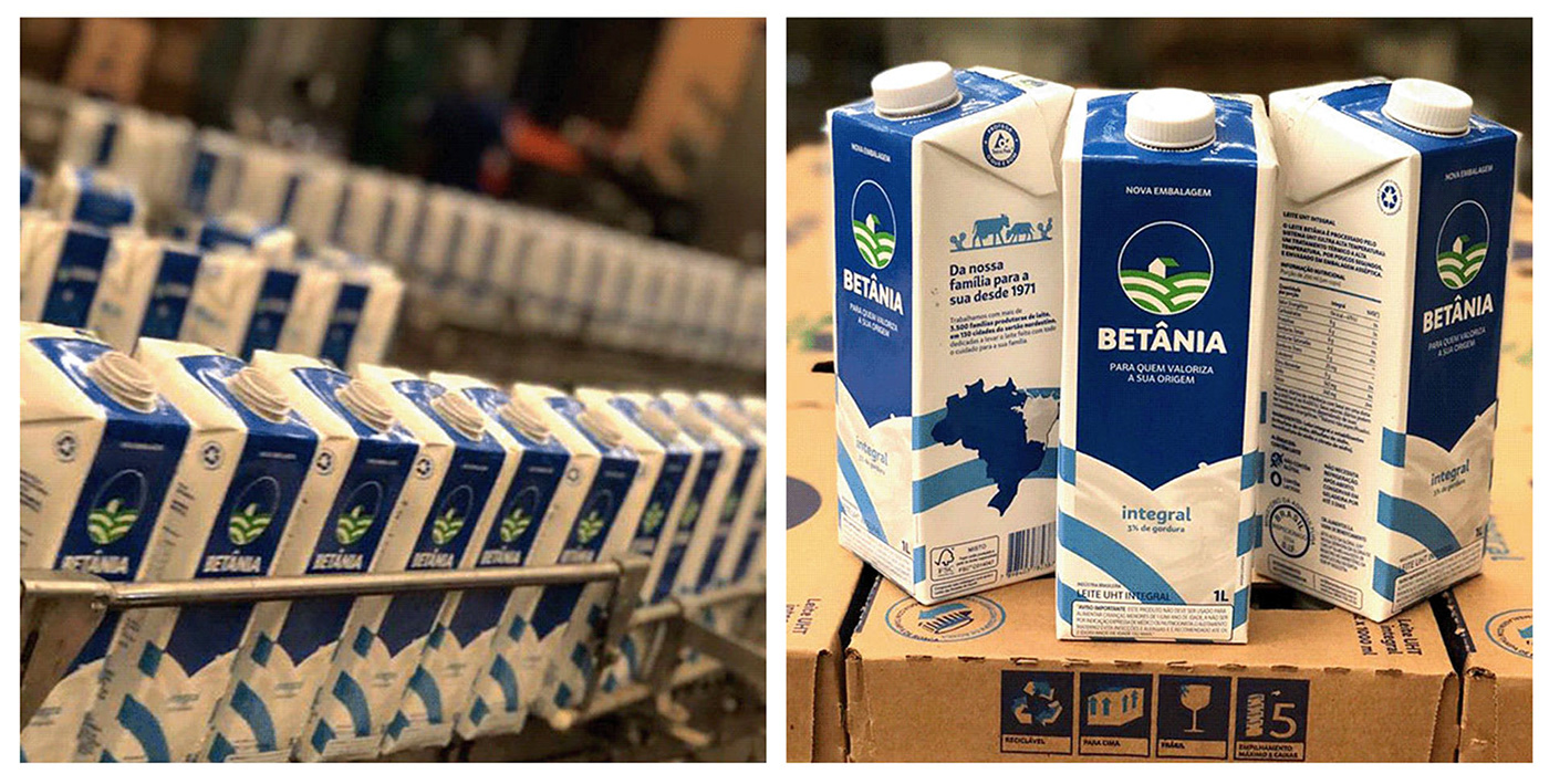
No início de 2018, a Tátil começa uma parceria com a Betânia Lácteos, uma das marcas líderes do mercado de laticínios do Nordeste, abraçando o desafio de desdobrar a nova linguagem em embalagens e modernizar a marca, sem abandonar suas origens e sua trajetória.
Para isso fomos a campo e imergimos no processo de produção no sertão do Ceará, para em seguida elaborarmos um sistema de embalagens completo, que inclui mais de 130 produtos da marca.
EN
In early 2018, Tátil started a partnership with Betânia Lácteos, one of the leading brands in the Northeast dairy market, embracing the challenge of unfolding the new language in packaging and modernizing the brand without abandoning its origins and its trajectory.
To do this, we went to the field and immersed ourselves in the production process in the hinterland of Ceará to elaborate a complete packaging system, which includes more than 130 brand products.
To do this, we went to the field and immersed ourselves in the production process in the hinterland of Ceará to elaborate a complete packaging system, which includes more than 130 brand products.
PT
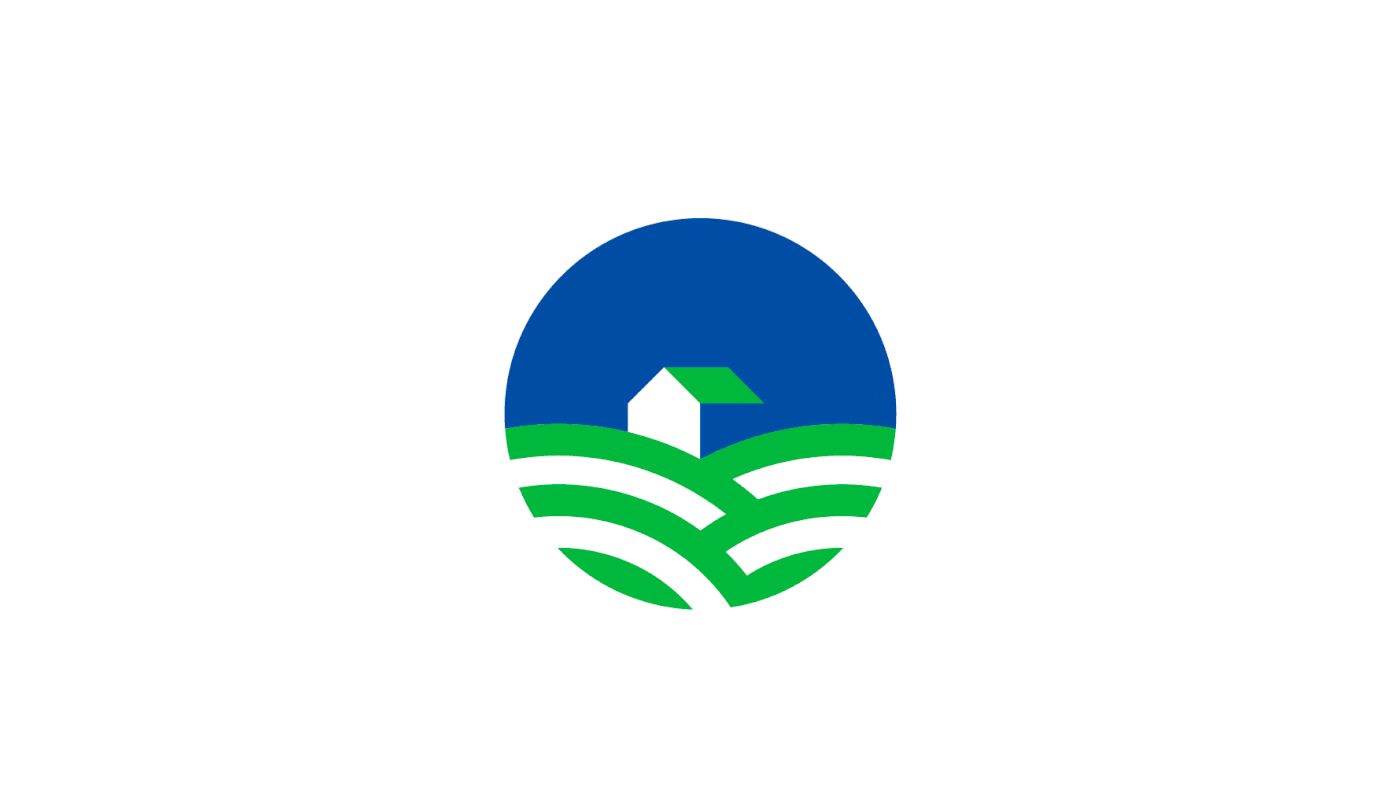
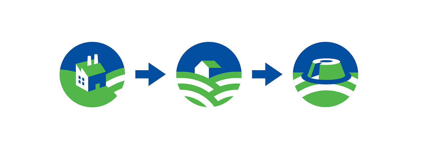
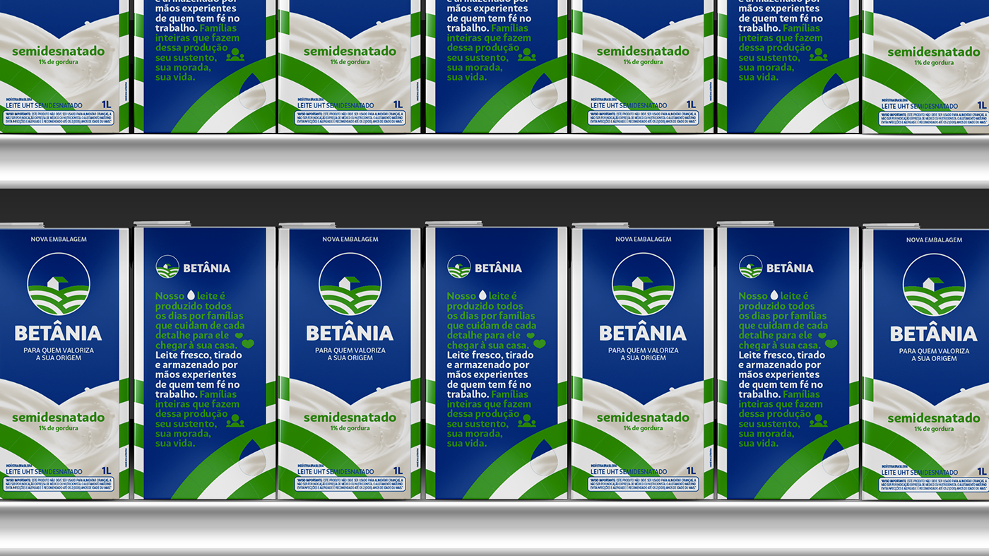
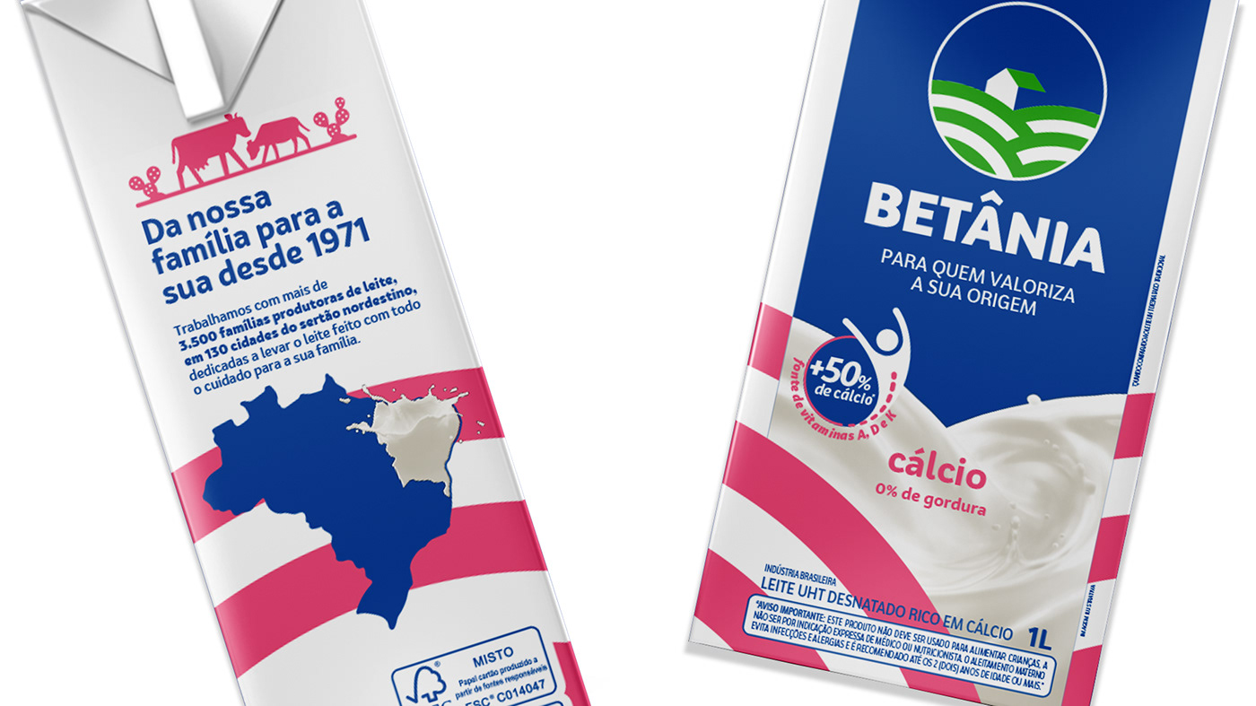
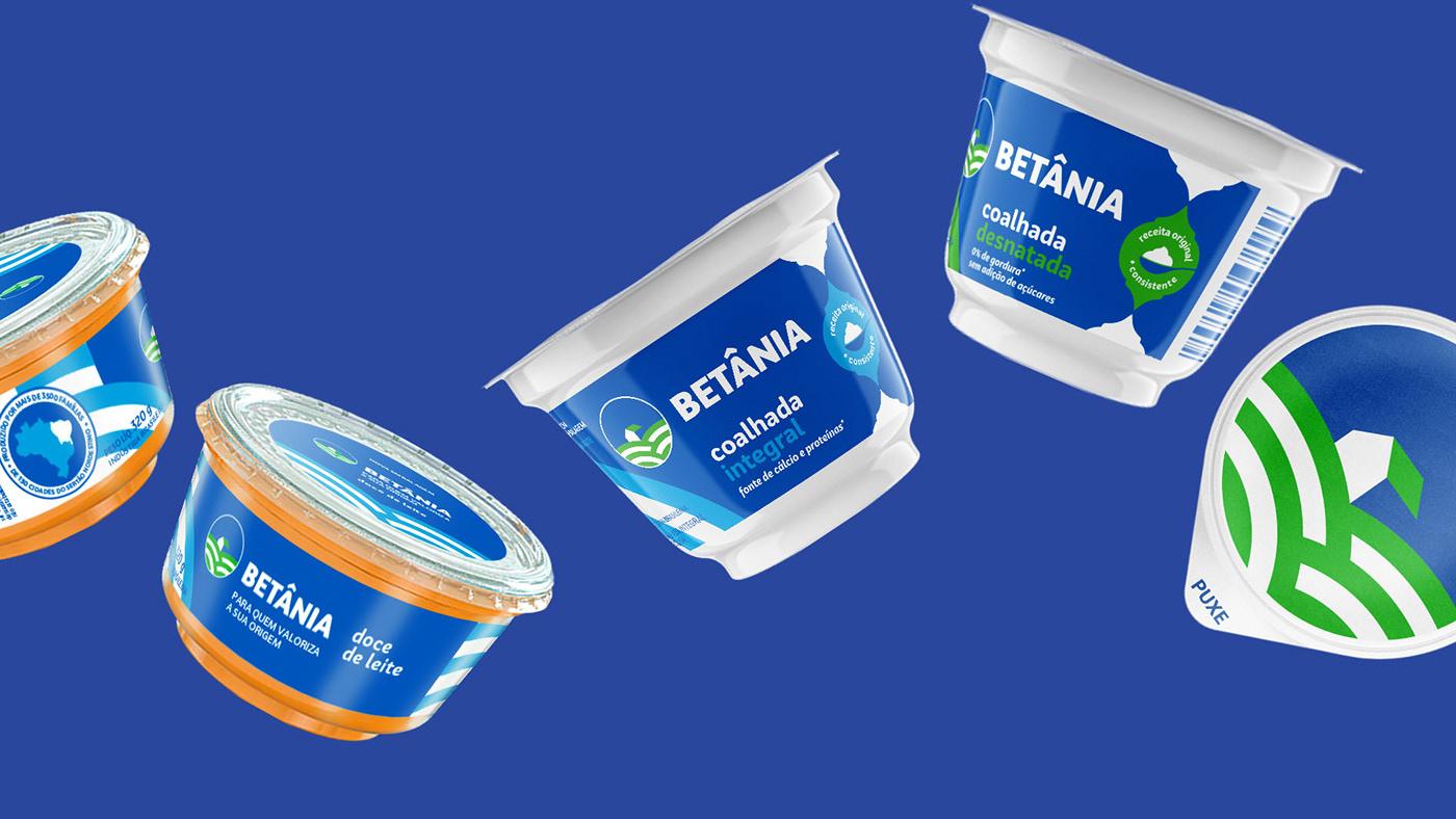
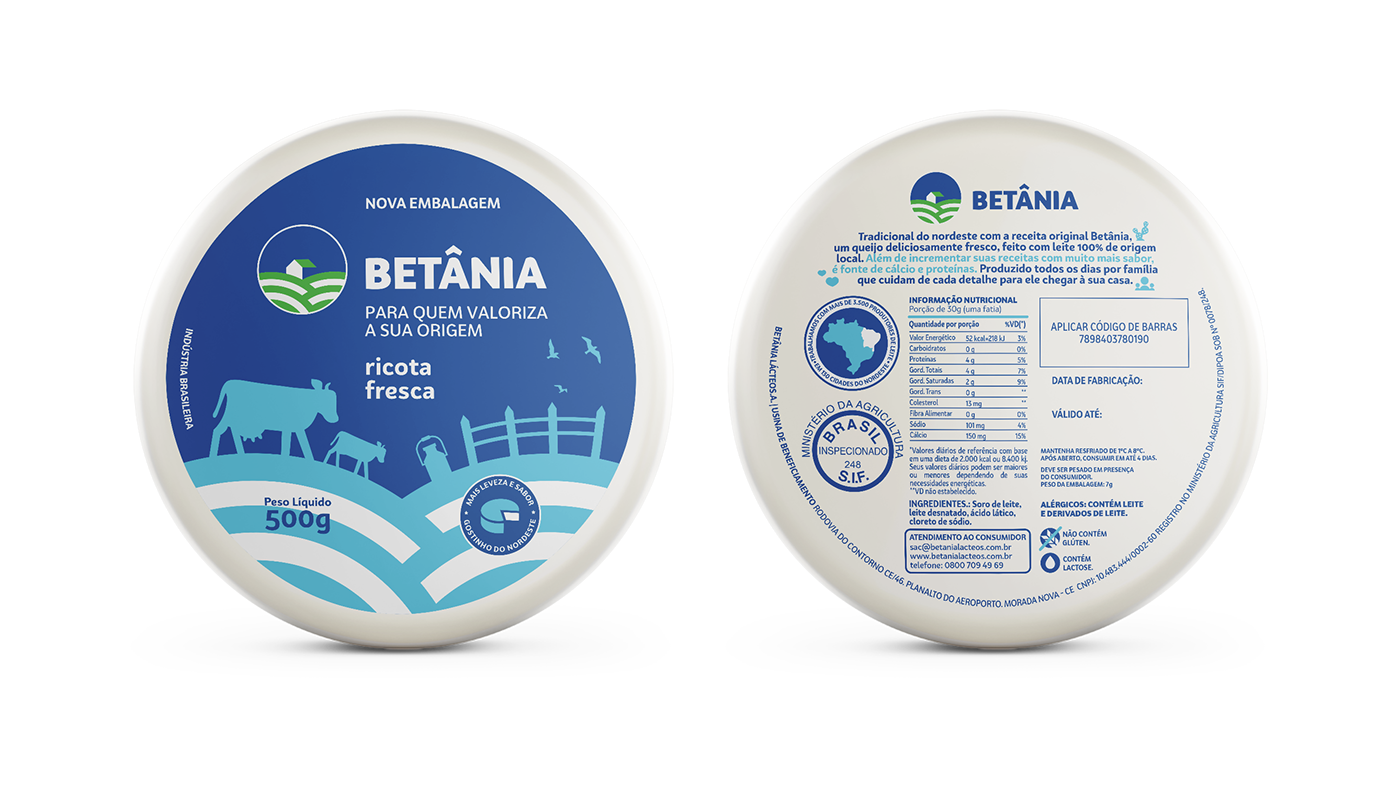
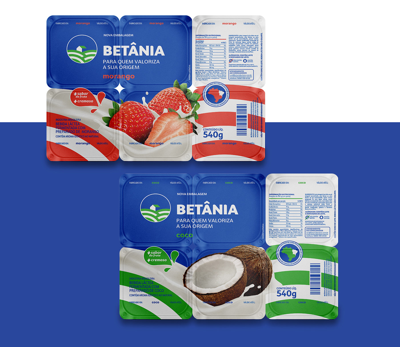
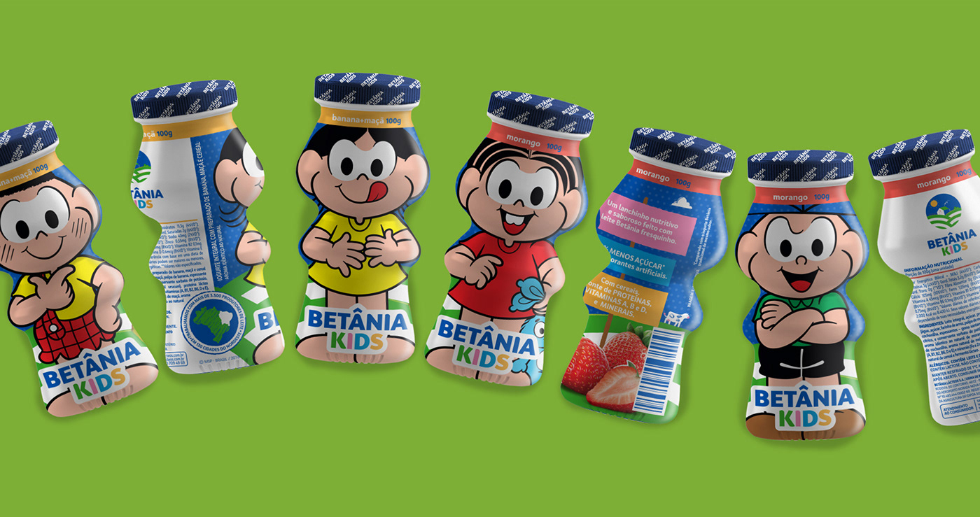
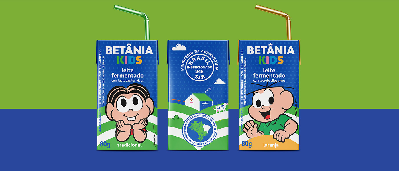
Para compor a família de produtos Betânia, trouxemos o principal asset da marca, sua origem.
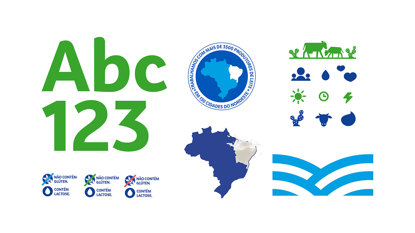
A marca nasceu e se construiu no sertão nordestino, reunindo mais de 3 mil famílias produtoras de leite, que são representadas através de grafismos e linguagem iconográfica. Nossa preocupação foi manter um sistema reconhecível em qualquer parte do mercado, criando uniformidade entre os produtos, para que a linguagem saísse da fragmentação e entrasse numa nova fase, mais consistente e forte.
Para compor a família de produtos Betânia, trouxemos o principal asset da marca, sua origem.
A marca nasceu e se construiu no sertão nordestino, reunindo mais de 3 mil famílias produtoras de leite, que são representadas através de grafismos e linguagem iconográfica. Nossa preocupação foi manter um sistema reconhecível em qualquer parte do mercado, criando uniformidade entre os produtos, para que a linguagem saísse da fragmentação e entrasse numa nova fase, mais consistente e forte.
“O leite que brota da terra”. É um dos grafismos que marca presença nas embalagens, além do azul,
tão forte no reconhecimento da marca pelo consumidor. Para contar a história da marca e falar da qualidade dos produtos, utilizamos recursos tipográficos e ícones, sempre ressaltando a história e
a origem da marca.
tão forte no reconhecimento da marca pelo consumidor. Para contar a história da marca e falar da qualidade dos produtos, utilizamos recursos tipográficos e ícones, sempre ressaltando a história e
a origem da marca.
EN
To compose the Betânia family of products, we brought the main asset of the brand, its origin (from where it came from). The brand was born and built in the northeastern hinterland, bringing together more than 3 thousand milk-producing families, represented through graphics and iconographic language. Our concern was maintaining a system recognizable in any part of the market, creating uniformity between the products so that the language would leave the fragmentation and enter a new phase, more consistent and robust.
To compose the Betânia family of products, we brought the main asset of the brand, its origin (from where it came from). The brand was born and built in the northeastern hinterland, bringing together more than 3 thousand milk-producing families, represented through graphics and iconographic language. Our concern was maintaining a system recognizable in any part of the market, creating uniformity between the products so that the language would leave the fragmentation and enter a new phase, more consistent and robust.
"The milk that flows from the earth." It is one of the graphics on the packaging, in addition to blue, so strong in brand recognition by the consumer. To tell the brand's story and discuss the quality of the products, we use typographic resources and icons, always highlighting the history and origin of the brand.


PT
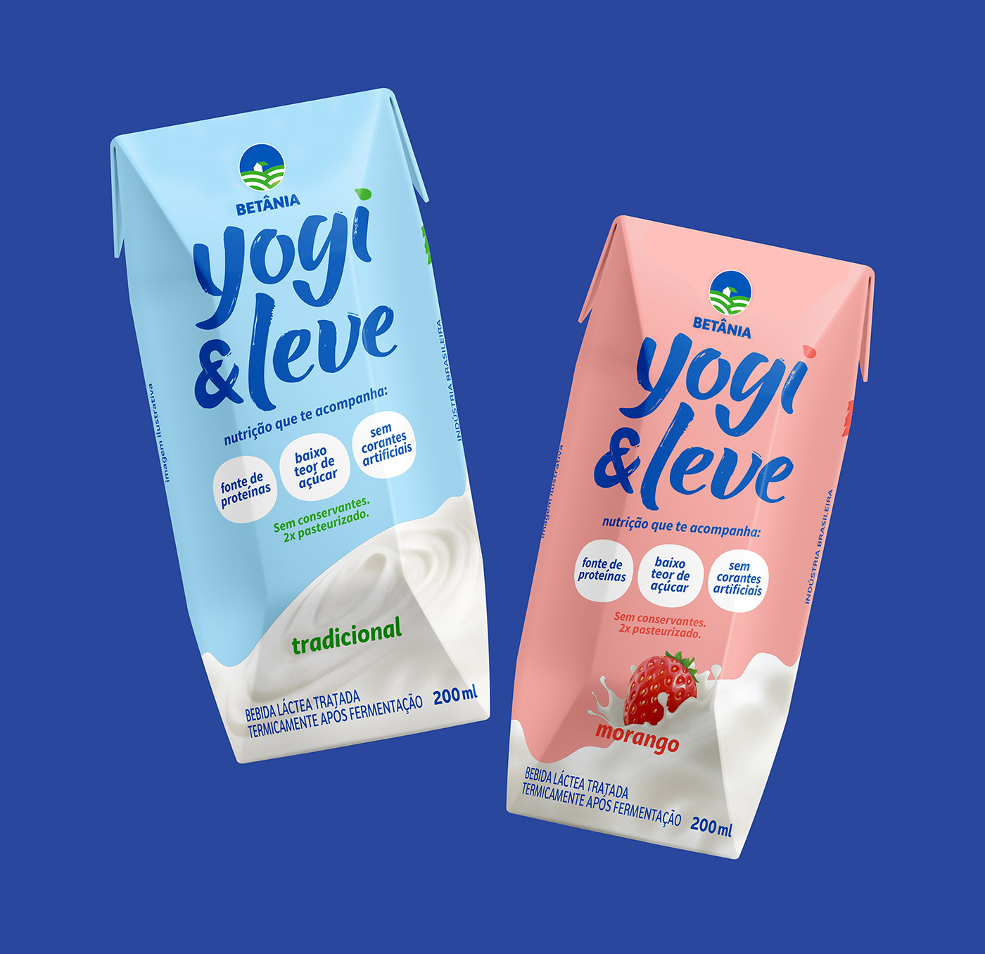
O Iogurte Ambiente se mostrou um sucesso na China principalmente pela demanda do consumidor por conveniência. Nosso desafio era construir um produto com uma proposta inédita: um iogurte que pode ficar fora da geladeira, podendo com facilidade ser levado pra qualquer lugar e ser consumido a qualquer a hora. O mercado brasileiro possuia as características semelhantes ao mercado chinês: preocupação com a nutrição e conveniência, "snackficação" e uma inexistência de ofertas semelhantes.
O Iogurte Ambiente se mostrou um sucesso na China principalmente pela demanda do consumidor por conveniência. Nosso desafio era construir um produto com uma proposta inédita: um iogurte que pode ficar fora da geladeira, podendo com facilidade ser levado pra qualquer lugar e ser consumido a qualquer a hora. O mercado brasileiro possuia as características semelhantes ao mercado chinês: preocupação com a nutrição e conveniência, "snackficação" e uma inexistência de ofertas semelhantes.
EN
Ambient Yogurt has proven successful in China primarily because of consumer demand for convenience. Our challenge was to build a product with an unprecedented proposal: a yogurt that can be left out of the fridge and can quickly be taken anywhere and consumed at any time. The Brazilian market had characteristics similar to the Chinese market: concern with nutrition and convenience, "snackfication," and a lack of similar offers.

PT
A NUTRIÇÃO SAIU DA GELADEIRA
O YogiLeve é feito para acompanhar todos os ritmos, em qualquer lugar. É uma bebida asséptica (livre de bactérias) que passa por dupla pasteurização. Assim, mantém o delicioso sabor e a cremosidade do iogurte, sem precisar ir à geladeira! Ah, e tem muito mais proteína que os leites aromatizados e bebidas lácteas! O equilíbrio ideal entre nutrição e praticidade. Pra qualquer momento e qualquer lugar. É só pegar e levar!
EN
NUTRITION LEFT THE REFRIGERATOR
YogiLeve made to keep up with all rhythms anywhere. It is an aseptic (bacteria-free)
drink that undergoes double pasteurization. This way, it keeps the delicious flavor and creaminess of the yogurt without having to go to the fridge! Oh, and it has much more protein than flavored milk and dairy drinks! The ideal balance between nutrition and practicality.
Anytime and anywhere. Just pick it up and take it away!


Tátil Design
Creative Direction: Ilana Bandarovsky & Ricardo Bezerra
Designers: Ana Amélia Martino, Camila Dias, Clara Silva, Gabi Diaz, Gabriela Noval,
Laís Tavares & Mariana Garcia.
Acct. Executive: Bianca Cruz, Adriana Coelho
Creative Direction: Ilana Bandarovsky & Ricardo Bezerra
Designers: Ana Amélia Martino, Camila Dias, Clara Silva, Gabi Diaz, Gabriela Noval,
Laís Tavares & Mariana Garcia.
Acct. Executive: Bianca Cruz, Adriana Coelho
Copywriters: Ana Cunha, Ingrid Taveira & Lorenço Araújo


